Nokia's fired out some
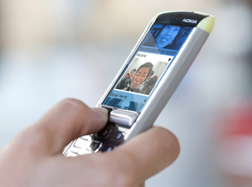
interesting concept phones this year, but this newest "People First" design centers more on the functionality of the device than its physical shape. The idea is based around what Nokia calls "three human universals of the way people think about communication" which are time, lists and people. So instead of being the standard pile of multi-option menus, the UI relies on a scrolling history list, with the most relevant and recent things popping onto the top.The phone would have a kind of dual-layer display: the main monochrome "history" scroller, and a smaller color display that deals with your selected options. At heart it's very simple, having just the "mobile essentials" of phone (or push-to-talk), camera, calendar and calculator. But this is where hacking comes in: the idea is that the phone would have widgets support, a simple and accessible programming language and openly available software and hardware specs. Presumably Nokia imagines a host of applications would arise, better-suited to user's needs than "default" applications, and saving them the bother of designing them too.
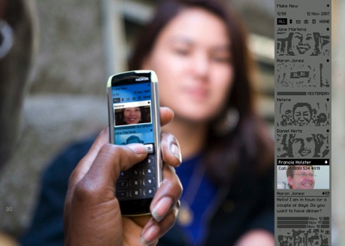
Matching the list-like, graphic-heavy nature of the UI, the phone would have a long, slender screen with a kind of jog-dial interface. Do we expect to see a real phone just like this anytime soon? Probably not. But we kind of like the direction this concept is taking— placing how people
use their phones at the heart of design. What's your opinion guys: do you think this would work? [
Nokia,
Like Cool and
Behance]
[Via:
Gizmodo, The Gadget Blog ]
[Tag: ]


No comments:
Post a Comment